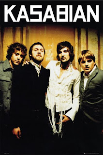
This is a poster promoting the band Kasabian.The first thing you notice when you look at this poster is the four band members all looking directly into the camera which could show they are trying to connect with the viewer and catch their eye. Their clothes and general image comply with their image of being an indie rock band. The way the title is against a black background instead of the background the band are standing against and written in white makes it completely stand-out and very noticable. The title is also written in the same font that the word Kasabian is written in on their album covers and other merchandise from them which makes the poster unique to the band. The overall poster is also reasonably easy to read and view. The font is easy to read and because the band are lined up they are all easy to see and notice meaning no one will be confused and know exactly what and who they are looking at.

No comments:
Post a Comment