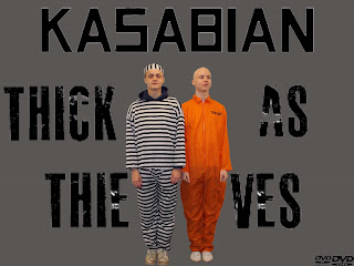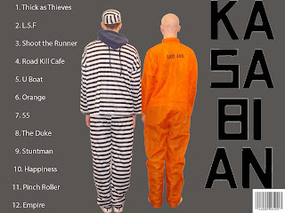

These are the front(left) and back(right) covers of the album cover for the ancillary task. Both are of a simple form. The background is a simple grey colour almost like a prison colour to go with the idea of prison as the characters are a thief and a jail inmate. Both covers, front and back both have the name of the band, kasabian in the same font that the bands name is written in on all their albums to make the cover look more realistic as a kasabian album. The photos are the same but just from a different view giving it the effect that the characters are being panned. The song list on the back cover is in an easy font to read, numbered and is white against a grey background making it easy to read. The album name 'thick as thieves' is written in a different font (master class) that is more eye catching and appealing but is still easy to read. The word kasabian on the back cover is broken up and written downwards. I think this is a good effect and makes the whole task look more interesting. The barcode and the DVD logos on the back and front covers respectively makes the album look more genuine as a whole.

No comments:
Post a Comment