Name:Conor Harris
Candidate Number:3081
Centre Number:51319
Monday, 10 May 2010
Thursday, 1 April 2010
ancillary tasks
We have decided that the ancillary task that shall be our chosen one to go with our video is marcus whiteways. We chose it because we thought it as the best one because it looks the most realistic and was created well using photoshop.
It can be seen http://www.musicblogington.blogspot.com
Wednesday, 31 March 2010
Front and back of album cover-ancillary task


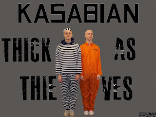
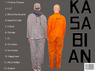
These are the front(left) and back(right) covers of the album cover for the ancillary task. Both are of a simple form. The background is a simple grey colour almost like a prison colour to go with the idea of prison as the characters are a thief and a jail inmate. Both covers, front and back both have the name of the band, kasabian in the same font that the bands name is written in on all their albums to make the cover look more realistic as a kasabian album. The photos are the same but just from a different view giving it the effect that the characters are being panned. The song list on the back cover is in an easy font to read, numbered and is white against a grey background making it easy to read. The album name 'thick as thieves' is written in a different font (master class) that is more eye catching and appealing but is still easy to read. The word kasabian on the back cover is broken up and written downwards. I think this is a good effect and makes the whole task look more interesting. The barcode and the DVD logos on the back and front covers respectively makes the album look more genuine as a whole.
Wednesday, 10 March 2010
Ancillary task-Advertisement
 This is the advertisement part of the album. Like the real 'kasabian' one i tried to make it simple and eyecatching. The simple parts of the poster are that for one despite their being three different fonts, one for the name kasabian, one for the album name and one for the information at the bottom all three are reasonably easy to read. Another simple part of the poster is the picture. It is a very similar picture that i'll be using on the front cover of the album making it instantly link. It is a simple photo as it is of the two caracters standing and looking straight into the camera. The background is another simple aspect as it is just plain grey but is another link to the album itself as the album cover will have the exact same background. The eye catching parts of the poster is mainly the banner at the bottom which is bright red with information such as the release date of the album and quote's from industries what they thought of the album all in capitals with explatation marks to make them stand out that bit more. The photo of the two characters maybe a simple one but eye catching as they both wear reasonably noticable outfits that draws the eye especially on the grey background. The word 'kasabian' is at a slant making the word stand out from the most making it the most noticeable word on the poster making it the first thing you read.
Friday, 5 March 2010
Advert analysis
 This is a poster that advertised Kasabian's album 'underdog'. The background is a very simple concept in the fact that it is just a plain white. The whole poster in general is very simple with the main image being just a person standing in the middle of the image with a plain white top. The writing "kasabian" is also in a simple font and the same font that the band use for all their advertising so will be the font i shall use when the name 'kasabian' features on my work. The name of the album 'underdog' also runs on a simple form in that the font is simple and easy to read. However, just because the poster is simple it is also eye catching. The head of the man on the poster is blurred so it looks like the man is looking at the side and dead on at the same side. Another eye cathing feature that grabs the eye is the word 'kasabian' is a reasonably bright red witch stands out and is also written backwards instantly catches the eye. The album name 'underdog' is probably the most simple thing on the poster it still stands out as the thick black outing of the word against the white clothing of the man is enough to keep it simple yet eye catching which is what most items on this poster do and i will try to do the same to mine.
Saturday, 27 February 2010
Wednesday, 24 February 2010
Video finished and ideas for ancillary tasks
Our video has now been finished and edited and are happy with the final result and will soon be put on youtube to view. Our next task is the ancillary tasks, an advert and album covers, front and back with also an booklet cover for the insert of the album. My initial idea is to keep the album and advert simple and not to over do it. I will just use a simple colour as the background, possibly a grey to give a prison look to it given the name of the song thick as thieves and the two characters being a thief and a jail inmate in our video. I will use a photo from the number we took of the two characters just standing side by side as this also looks simple. I will also use the same photo on the album cover in the advert and similar colours so they look similar however the advert will look slightly more eye catching possibly with a brighter banner supplying information such as date release.
Tuesday, 26 January 2010
Personal filming progress
Filming is going well on a personal view with my job as the main actor going well with many ideas being possible to bring to reality and taking few takes to complete. The main problems that filming is facing can be seen on the group blog but one that solely involved me was that i went on holiday for a week meaning that filming was impossible for this period of time.
Subscribe to:
Comments (Atom)
