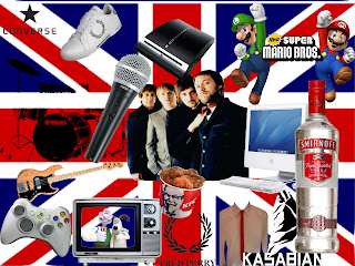
 This is my audience profile i did for Kasabian .I put an image of Kasabian in the centre and the image on their album in the bottom left so the band in question can be easily identified. The background is the Union Jack. I chose this because the band come from Britain and this is where they started. I also added modern technology such as macs and the latest game console and equipment to keep up with the bands modern image. The clothing labels converse and fred perry are the type of clothes the band wear along with most of their fans. Along with the Union Jack I also put things that have been a success in Britain such as Wallace and Gromit and the game mario bros. both of which are successful in Britain and household names. I put musical instruments such as guitar and drum kit along with a microphone just to ensure that there is a musical feel to the piece. The food and drink i put into the piece is KFC and a bottle of vodka which is typical things young people consume and the majority of their fans are young.
Friday, 20 November 2009
Audience profile
 This is my audience profile i did for Kasabian .I put an image of Kasabian in the centre and the image on their album in the bottom left so the band in question can be easily identified. The background is the Union Jack. I chose this because the band come from Britain and this is where they started. I also added modern technology such as macs and the latest game console and equipment to keep up with the bands modern image. The clothing labels converse and fred perry are the type of clothes the band wear along with most of their fans. Along with the Union Jack I also put things that have been a success in Britain such as Wallace and Gromit and the game mario bros. both of which are successful in Britain and household names. I put musical instruments such as guitar and drum kit along with a microphone just to ensure that there is a musical feel to the piece. The food and drink i put into the piece is KFC and a bottle of vodka which is typical things young people consume and the majority of their fans are young.
Tuesday, 10 November 2009
 This is another Kasabian poster yet this one is less eye catching than the previous two. The poster is of the band performing on a stage but in black and white meaning the main image of the poster isn't particulary eye catching. The only part of the poster that does capture your attention is te title. It is big, bold and red on a black background and is also in the font that the band use on their album covers and their official merchandise. This makes this part of the poster stand out from the rest and alure the viewers into looking at the poster.
Friday, 6 November 2009

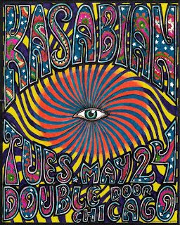
This Kasabian poster advertising there performance in Chicago, USA is extremely colourful and eye catching. The numerous swirling colours in the background with the multi-coloured title in the bubble writing and the stars make the poster seem very psychedelic. It is the colours that instantly attract you to the poster but it is the eye in the centre of the poster that keeps you looking at the poster. The eye in the middle of the poster keeps you looking because it almost seems that the poster is staring at you almost like a painting and this means that you can barely help staring back. This poster is good advertising as it doesn't just attract a viewer but keeps them attracted.
Subscribe to:
Comments (Atom)
